///////
Redesign of Xfinity Streaming Webpage
How to Save Xfinity Stream
Duration
Jun—October
2024
My role
UI/UX Designer
Researcher
Tools used
Figma
Photoshop
Project goal
Imagine visiting the Xfinity Stream website to watch your favorite shows, only to be met with outdated designs and cumbersome navigation.
While other Xfinity apps have evolved with cohesive design guidelines, the streaming site has lagged behind, creating a disjointed user experience. Recognizing this long-standing inconsistency, this project aims to make a comprehensive overhaul of the Xfinity Stream website.


This redesign is more than a visual update; it's a commitment to providing a seamless and enjoyable streaming experience that reflects the quality and innovation synonymous with the Xfinity brand.
see results
Understanding the users
Who is even using the website in the first place? What are the issues they're having?
Based on the available data, Xfinity Stream is primarily used by an older demographic, with the majority of users falling within the 55–64 age range. Women make up a larger portion of the audience at 56.79%, compared to 43.21% male users. This suggests that the platform is a go-to service for a more mature audience, likely seeking familiar and convenient access to television content rather than exploring newer streaming alternatives.
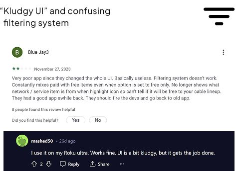
Despite its popularity, the platform feels outdated, frustrating users with poor navigation, a confusing filtering system, and missing features like live TV rewinding and screen mirroring support. A redesign is overdue to modernize the experience and align it with Xfinity’s design standards.
Understanding the style
At the time I worked as Product Experience Associate at the store and was very familiar with all the lineup of the company, where it's located, and how it works. This helped me identify the specific pages redesigning which would make the best case for initiating a redesign.
Onto the next stage. Everyone's favorite paper sketching.
I actually don't do paper sketches that often, however, in this specific example I needed to come out with a lot of different ideas fast as this was directly contributing to collecting feedback from customers that were coming back to me on certain days, and I might never see them again. Additionally, this helped streamline the overall process without spending too much time on the sketching phase.
Next, I created two visual directions—
A & B—for the remainder of the project
Initial Feedback
Two rounds of interviews were conducted: structured and semi-structured. Primary feedback for this time were semi-structured interviews conducted in Xfinity store at Redmond, WA with customers of Xfinity that were interested in participation.
Screencast Icon: Added to meet user expectations Playback Controls: Maintained central position but visually integrated with the show content
Consistency: Kept layout for show info, progress bar, and additional controls; familiarity with the former player layout
Navigation: The revised mockup removes margin selections for buttons "For You", "Saved", "Live TV", and "Browse"
Separation: Revised version introduces a distinct horizontal line separating the settings menu from the settings themselves rather than using margins/spacing
LIVE show: The "Live" label replaced “Now Playing”
Search Bar: The search bar in the top navigation now has a more prominent visual treatmentNavigation
Labels: The navigation labels ("For You", "Saved", "Live TV", "Browse") received some refinements in their styling and positioning
More testing
First testing after another the last changes I needed to make sure that those changes are perceived well and align with Xfinity style. Otherwise this would be the moment to step back and look for different solutions.
The main points from the Five Second Testing were:
"The interface was praised for its clean and straightforward design. Participants found the layout intuitive and easy to navigate"

"Most participants identified the Xfinity brand immediately. All participants correctly identified the product as a streaming service that includes both live TV and on-demand content"

"Participants compared the mockup to other streaming services like Hulu, Netflix, and YouTube TV. The combination of live TV and on-demand content was a common point of comparison"

"While the design was well-received, some participants noted that it did not stand out significantly from other streaming services they were familiar with"
With this feedback I've made some changes and went on the quest to find out if I heard the feedback correctly. Minor changes on typography and iconography were made between the Version 1 and Version 2.
Conducting A/B Testing
Two rounds of interviews were conducted: structured and semi-structured. Primary feedback for this time were semi-structured interviews conducted in Xfinity store at Redmond, WA with customers of Xfinity that were interested in participation.
I was very happy to receive the results of this testing which proved that the implemented changes were met positively and my research led me onto something here. People didn't see any major issues or problems that arose with the new design, so I proceeded to compile a recommendation to send to Xfinity designers.
UI Style Guide
Iconography
Color
Typography
Grid System
Soo... What Went Live?
After I passed my research and redesign to designers I received good reviews from the design team and then all went silent for about 2 weeks.
While not all elements from my redesign were implemented, several key aspects influenced the final live version of the site.
What was adopted:
Color and Contrast Improvements:
My updated color palette recommendations were taken into account, resulting in better visual hierarchy and improved accessibility throughout the interface.
Refined Visual Direction:
The final design reflects the cleaner, more modern layout similar to what I proposed, while maintaining brand familiarity—a core part of my design rationale.
Usability Enhancements:
Although the exact mockups were not used, many functional and visual decisions such as spacing, sizing, and contrast of key elements were aligned with the usability insights I uncovered through user interviews and informal testing.This collaborative outcome validated the impact of my research and showed how user-centered thinking can guide product evolution even within a large-scale enterprise environment. It also reinforced my ability to translate feedback and design direction into real-world improvements.
Next Steps and Lessons Learned
While I don't work at Xfinity anymore I would define next steps as:
● Explore more formal usability testing methods (e.g., moderated sessions, heatmaps) to gather deeper insights.
● Iterate further on micro-interactions and accessibility features to enhance user experience.
● Continue collaborating cross-functionally with internal teams to align research with business goals and technical feasibility.

The most important section for me here though is the lessons I learned:
● Small, research-driven changes can lead to significant impact, especially in large organizations.
● Brand consistency is crucial—refreshing a design doesn’t mean reinventing it.
● Informal user feedback, when structured thoughtfully, can uncover valuable usability issues early in the process.
● Find technical constraints ahead of time. While I tried my best to define the constraints, I went above the scope of what's possible to do for a player (e.g. rewind and casting which had a lot more technical specifications than I anticipated).
All the way up

I promise I check my email!

Get in touch by sending me an email or just say Privet.

Thank you! Your submission has been received!
Oops! Something went wrong while submitting the form.